
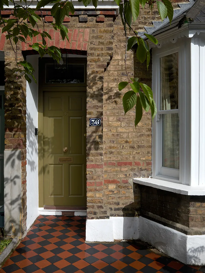
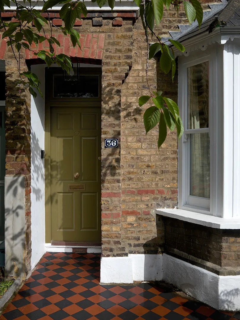
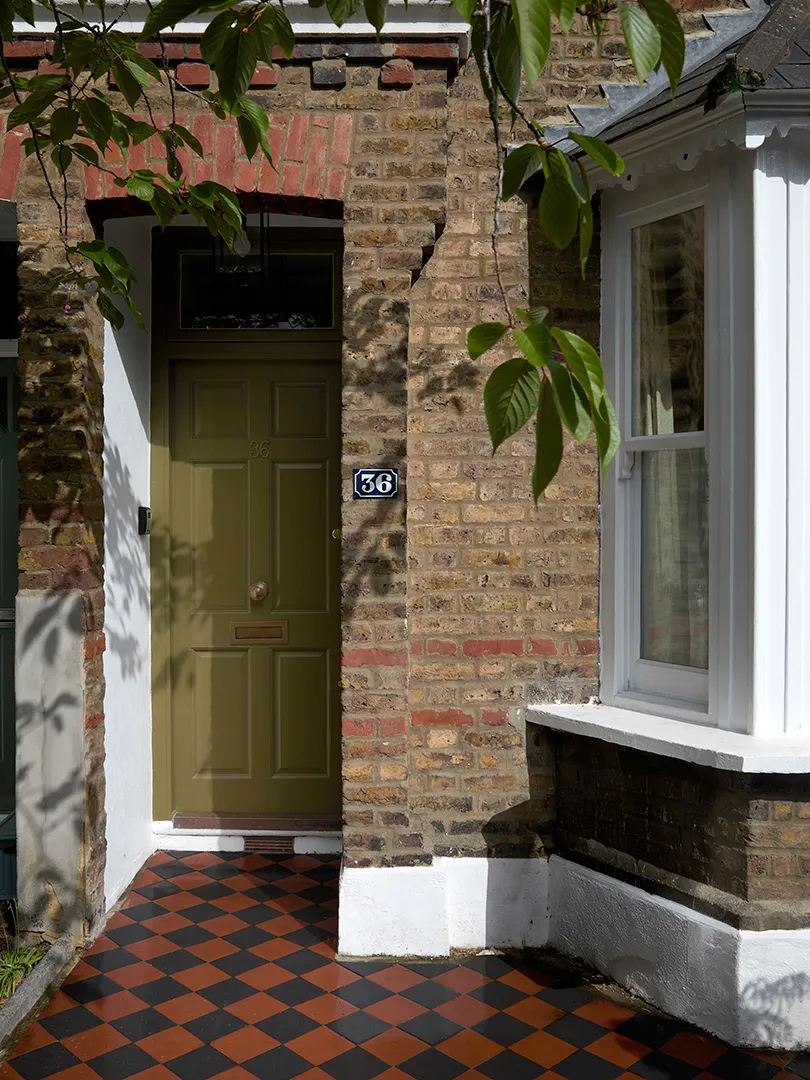
A London cottage has been transformed into a warm, inviting home through a bold color choice and thoughtful design details. The renovation, led by interior architect Anthi Grapsa, reimagines the original disconnected layout into a cohesive, light-filled space that supports both personal relaxation and social interaction. Source: domino.com.
Main Design Priorities
The homeowner, who works in the music industry and travels frequently, needed a home that could serve as both a sanctuary after long journeys and a welcoming environment for hosting friends. The original layout of the cottage—particularly the ground floor—was fragmented, with poor flow between key living areas. Grapsa identified that the home lacked a sense of continuity, especially between the kitchen, dining area, and outdoor patio. Her primary goal was to create a space that felt calm, grounded, and human—where the rhythms of daily life could be embraced without effort.
She approached the renovation not just as a visual upgrade, but as a functional reconfiguration. By opening up the back of the house and redefining the spatial relationships, she created a more fluid and intuitive flow. This transformation allows the homeowner to move seamlessly from the kitchen to the dining area and then to the patio, making the home feel expansive and connected to its surroundings.
Key Changes and Scope
The most significant structural change involved replacing a small glass extension at the rear of the cottage. This original addition was poorly insulated and structurally unsound, limiting both natural light and thermal efficiency. Grapsa’s solution was to remove it and build a new, light-filled kitchen extension. This new space is designed to maximize daylight, with a large skylight positioned directly above the kitchen, allowing the sun to pour in throughout the day.
The new kitchen is not just a functional space—it acts as a visual and physical pivot point. By integrating the kitchen with the dining area and patio, the design eliminates the sense of separation that once existed. This reconfiguration makes the home feel more open and alive, especially during the evening when natural light is low and the space is used for social gatherings.
Use of Salvaged Materials
One of the most compelling aspects of the renovation is its commitment to sustainability and material storytelling. Grapsa repurposed reclaimed iroko wood from old school laboratory worktops for the kitchen countertops. This material, once used in educational settings, now finds new life in a domestic kitchen, adding a layer of history and authenticity to the space.
She also salvaged a piece of marble from a stone supplier she regularly collaborates with. This marble was used around the kitchen sink, where it provides a durable, non-porous surface in a high-moisture area. The material choice not only adds practicality but also reflects a design philosophy that values reuse and respect for existing resources.
The existing pine flooring was repaired and refinished rather than replaced. This decision honors the original character of the home while updating its appearance. By preserving the original wood, Grapsa ensures that the home maintains a sense of continuity and timelessness, avoiding the feeling of being overly modern or sterile.
Why Blue Cabinets?
Blue was chosen not as a random color, but as a reflection of the homeowner’s personal taste. The client has long been drawn to blue, which she associates with calm, depth, and emotional stability. Grapsa recognized this as a powerful emotional anchor and used it as the foundation for the entire kitchen palette.
Instead of painting the cabinets, she applied a natural stain to the oak. This technique allows the grain of the wood to remain visible, creating a dynamic range of tones—from bright, vivid blues to deep, rich navy. The variation in color adds texture and visual interest, preventing the space from appearing uniform or flat.
To balance the coolness of the blue, a warm copper splashback was introduced. Copper, with its rosy and metallic undertones, provides a tactile contrast that softens the intensity of the blue. The terrazzo flooring further enhances the textural depth, offering a smooth yet slightly uneven surface that complements the organic feel of the wood.
Reverse Color Scheme in the Study-Slash-Guest Bedroom
Grapsa made a deliberate design choice to avoid painting the walls of the study-guest bedroom. Instead, she painted the ceiling and trim with a vibrant shade of red—specifically, Rouge II by Paint & Paper Library. This reverse color scheme creates a warm, dynamic focal point without making the room feel too dark.
By introducing color to the ceiling and trim, she achieved a visual framing effect. The red color is carried through the doors, skirting boards, and joinery, creating a consistent visual rhythm that ties the room together. This approach not only adds depth and dimension but also makes the walls feel lighter and more open, which is especially important in a small room that must serve dual functions.
The room functions as both a study and a guest bedroom, and the design ensures it remains versatile. The color choice supports the mood of calm focus in the morning and warmth in the evening, making it adaptable to different uses throughout the day.
Playful Touch in the Powder Room
One of the most unexpected and delightful elements of the home is the powder room. Located tucked beneath the stairs, it is concealed within the joinery, making it feel like a hidden feature rather than a separate, utilitarian space. Grapsa chose to feature a wallpaper by British designer Daniel Heath, titled Jumbo, which draws on Victorian-era circus imagery—whimsical, theatrical, and full of imaginative detail.
Smaller rooms are ideal for bolder, more expressive design choices. The wallpaper creates an immersive experience without dominating the rest of the house. Its playful, theatrical quality contrasts beautifully with the more grounded, functional spaces, adding a sense of surprise and delight to the home’s overall character.
Custom Etched-Glass Window
The original doorway between the kitchen and dining area was filled in as part of the new floor plan. To maintain a visual connection between the front of the house and the patio, Grapsa designed a bespoke etched-glass window. This window features a composition of curved and straight lines, with a color palette drawn from the home’s overall design—blues, copper, and terrazzo tones.
The etched glass offers privacy without creating a solid barrier. In the evening, when the sun sets, the colored glass casts a soft, textured glow on both sides of the space, transforming the window into a dynamic, living element of the home. It becomes a visual bridge between indoors and outdoors, enhancing both privacy and ambiance.
Personal Touches That Matter
While the design elements are intentional and well-executed, it is the small, lived-in details that give the home its authenticity. One such detail is the ginger cat that has claimed the sill of the new etched-glass window as its favorite spot. This moment—of a pet settling into a newly designed space—illustrates how personal elements can elevate a home from being merely functional to being deeply human and emotionally resonant.
Design Advice for Bold Choices
Grapsa emphasizes that bold color choices should not be made in isolation. Instead, they must be considered within the context of the entire room—its materials, textures, lighting, and existing elements. She recommends testing color samples in the actual space to understand how they behave under real-world lighting conditions.
She also stresses that the mood of a room and its intended use are critical considerations. A room designed for quiet focus will differ significantly from one meant for socializing. By building a palette that includes existing furniture, artwork, and rugs, designers can ensure that bold choices feel cohesive and intentional.
Ultimately, bold design decisions work best when they are part of a balanced, considered system—not a single statement made in haste. The success of this renovation lies in how every element—from the wood to the cat—works together to create a home that feels both intentional and lived in.
For more on the materials used, visit Morrells’ wood finishes. Learn more about the Paint & Paper Library’s Rouge II and Jumbo collections.
Grapsa’s work shows how thoughtful material selection, functional layout, and personal touches can create a home that feels both intentional and lived in.
Sources & further reading
Featured image: exterior with green door and checkered ground. Via original publisher. Image source
