If you happen to notice all the logos in the betting category, you’ll see they all blur into one: a bold italic sans here, an optimistic swoosh there, the odd lucky number thrown in for good measure. It’s a corner of design that rarely does personality and always takes the safe bet (see what I did there). So it’s a real pleasure to come across a brand in this field with a bit of character.
Stoiximan is the number one iGaming platform in Greece and Cyprus, and here’s the most satisfying bit: it saw off global operators to become the most recognisable brand in its category at home. Not bad for a local challenger.
Market leaders can’t afford to stand still, though, and Stoiximan knew it. So it approached Nomad to evolve an identity that had earned decades of trust, without throwing away the very thing that made people warm to it in the first place.
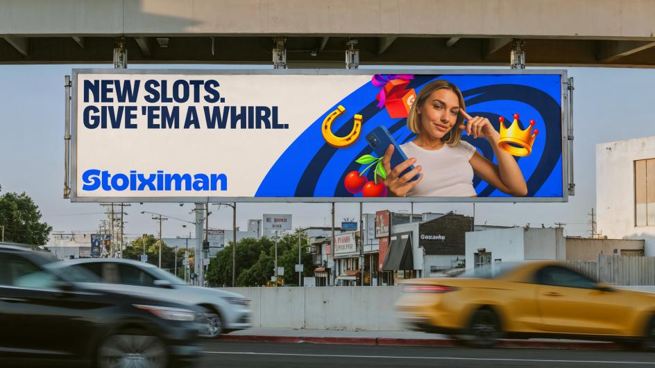
The timing mattered, too. With sponsorships stretching across the FIFA World Cup 2026, the UEFA Europa League and the UEFA Conference League, plus long-standing ties to the Stoiximan Super League, Olympiacos, the Greek Basketball League and a roster of national athletes, this identity had to hold up everywhere – from a phone screen on the sofa to a floodlit stadium on a Saturday night.

Rather than reach for another off-the-shelf logo, Nomad worked with Leo Field to create a completely bespoke wordmark for Stoiximan. Every letter has been given a bit of personality: rounded, expressive and confidently its own. And there’s a lovely detail hiding in plain sight – a little figure celebrating a win, tucked inside the “x”. The interlocking “S” does double duty, too. It’s the foundation of the brand’s motion system, and it works on its own as an instantly recognisable asset. One shape, doing a lot of jobs.
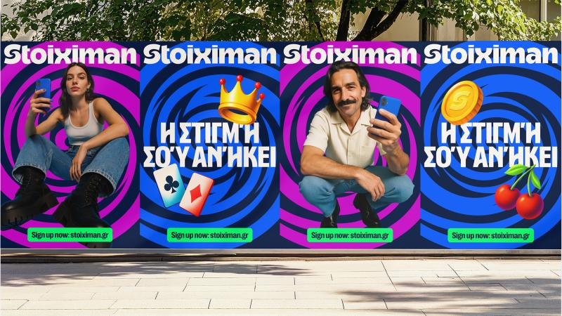
At the centre of the identity sits the Portal, a gateway into the brand’s world. Built around that new S symbol, it opens out into a flexible graphic system that brings depth, hierarchy and texture to everything Stoiximan touches, whether that’s an app interface or the boards around a pitch.
Working with Studio Drama, Nomad developed a custom typeface called Stoiximan Sans, its curves drawn straight from the Portal. It’s been built across both Greek and Latin alphabets, so the warmth and confidence of the identity carry through every word the brand says, whichever script it’s saying it in.
There was a practical puzzle to solve, mind. Stoiximan’s products span Sportsbook, Casino, Virtuals, Fantasy and eSports, and a growing portfolio like that needs an architecture that holds together without every sub-brand shouting over the masterbrand. Nomad’s answer was Stoiximan Sub Sans, a companion typeface made specifically for the sub-brand logos. Together, the custom wordmark and the sub-brand system flex across every product and platform without ever losing the thread.
So, is the client happy? It certainly sounds that way. “Partnering with Nomad Studio was one of the boldest decisions we’ve made as a brand,” says Kostas Diorelis, commercial director at Stoiximan. “They understood instinctively that moving forward didn’t mean leaving our roots behind. What started as a modernisation became a full reimagining: a fresh, contemporary identity that honours where Stoiximan comes from, while boldly signalling where we’re going. We couldn’t be prouder of what we built together.”