A London home in North London has been transformed with bold color choices, defying traditional interior design norms. Source: livingetc.com.
Designing with Color in a Victorian Terrace
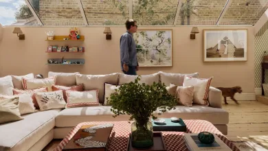
When Sophie Rowell of Cote de Folk first entered the Victorian-style terrace, she instinctively felt the living room should resemble a strong cup of tea.
She described it as ‘a good cup of strong PG Tips’—a vivid, punchy image that set the tone for the entire project. The room initially had stark white walls and a corner sofa facing the fireplace, a classic setup.
Rowell’s studio is known for neutral palettes. This project marked a departure, with the client’s bold preference for color pushing her into uncharted territory.
The Client’s Vision and Freedom
The homeowner, a twentysomething, wanted a space that reflected personal expression. Unlike family homes, there were no constraints about child safety or shared decisions.
Rowell compares the project to a holiday property, where design choices are less bound by practicalities. ‘It’s always a bit more freeing,’ she says.
This freedom allowed the team to prioritize aesthetics over functionality, creating a space that feels vibrant and intentional. The client’s desire to live in a home that mirrors her personality—rather than one that conforms to social expectations—was central to the design process.
Such personalization is increasingly valued in modern home design, especially in urban environments where space is limited and design must be both efficient and expressive. The absence of familial or functional constraints meant that every element could be chosen not just for utility, but for emotional resonance.
Unifying the Living and Dining Areas
The rear of the double reception room was traditionally underused. Rowell aimed to connect the two spaces to create a more fluid and inviting environment.
A custom curved sofa, designed to seat six-plus guests, faces into the center of the room rather than against a wall. This layout anchors the space and improves flow, making it ideal for hosting gatherings or casual conversations.
Many homeowners would hesitate to place a high-back sofa near windows due to concerns about light obstruction or visual imbalance. However, Rowell argues that the design works well in this context, offering both visual stability and a sense of continuity across the room.
The sofa’s curve mirrors the natural flow of the room’s architecture, creating a seamless transition between the living and dining areas. This approach reflects a growing trend in interior design—using form and proportion to guide movement and interaction within a space.
Functional Design with Hidden Elements
A bespoke alcove unit serves multiple purposes. It conceals a TV monitor and a record player and doubles as a home bar, blending functionality with aesthetic appeal.
Rowell uses a design trick: painting the frame a darker burgundy than the doors. ‘It gives an element of depth,’ she explains. ‘If it were all one color, it’d be boring.’ This subtle contrast adds dimension and prevents the piece from appearing flat or monotonous.
The unit’s design demonstrates how modern interiors can integrate technology and storage without sacrificing visual harmony. By concealing elements behind a custom structure, the space remains uncluttered while still serving practical needs.
Adding Personality with Playful Details
Fun radiator covers inspired by the game Connect Four reflect Rowell’s personal interest in circles and dots. These playful details are not merely decorative—they are a direct expression of her creative identity.
She launched her first spot-print fabric collection in 2025. These new features were added to the dining room and hallway, replacing old radiators without major disruption. The covers act as both a design statement and a functional perch for small objects like mugs or books.
The integration of these elements shows how personal passions can be translated into tangible design features. The game-inspired pattern is not just a visual motif—it is a nod to Rowell’s background in pattern design and her ongoing exploration of geometric forms.
The Central Piece: A Glass Coffee Table
A delicate glass coffee table ties the room together. Rowell calls it ‘like a piece of a puzzle.’ Without it, the space wouldn’t function cohesively. It balances the softness of the tea-hued walls and ceilings, creating a sense of harmony and completeness.
The table’s transparency and minimalism contrast with the boldness of the surrounding colors, yet it enhances the room’s cohesion. It acts as a visual anchor, drawing the eye and connecting different zones of the space.
Reimagining the Bedroom Layout
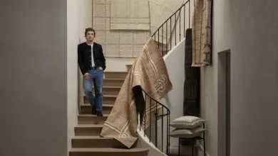
The project didn’t involve a full renovation. Rowell and her studio colleague Sarah Pinn convinced the owner to move her bedroom from the first floor to a converted attic. This shift allowed a walk-in wardrobe to be created in a small, awkwardly shaped room on the middle floor.
To maximize space, Rowell used galvanized poles and shelves hidden behind drapery. ‘Lots of cupboards means lots of doors,’ she notes. ‘You’d be fighting to access them in a space like this.’ This solution avoids the clutter of traditional wardrobes while maintaining organization and accessibility.
Efficient and Romantic Solutions
Instead of traditional wardrobes, floor-to-ceiling curtains were installed. This solution is both economical and visually romantic, offering a sense of elegance without requiring significant structural changes.
A plush olive-green carpet snakes up to the loft, complementing the citrus tones across other surfaces—including the upholstered headboard. Rowell describes the shade as ‘very calming but energizing at the same time.’ She adds that most people wouldn’t dare use such a bold color, making it a special and personal choice.
The Purple Touch and Bed Placement
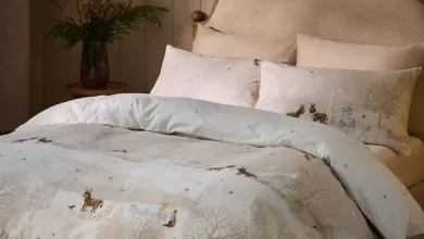
A jolt of purple from an antique linen bedspread was added last-minute. It was a happy surprise, not a planned element. The addition brought a dynamic contrast to the room’s otherwise warm, citrus-based palette.
The room layout was engineered around a super-king mattress. The bed is positioned right against the eaves—an unusual placement that makes the mattress a reality. This strategic positioning not only accommodates the large size but also creates a sense of intimacy and privacy.
The bed is framed with a nubby shantung silk structure that also acts as a shelf and frontage for loft storage. This dual-purpose design ensures that storage is integrated seamlessly into the room’s structure, avoiding visual clutter.
Masking Incongruities with a Dressing Desk
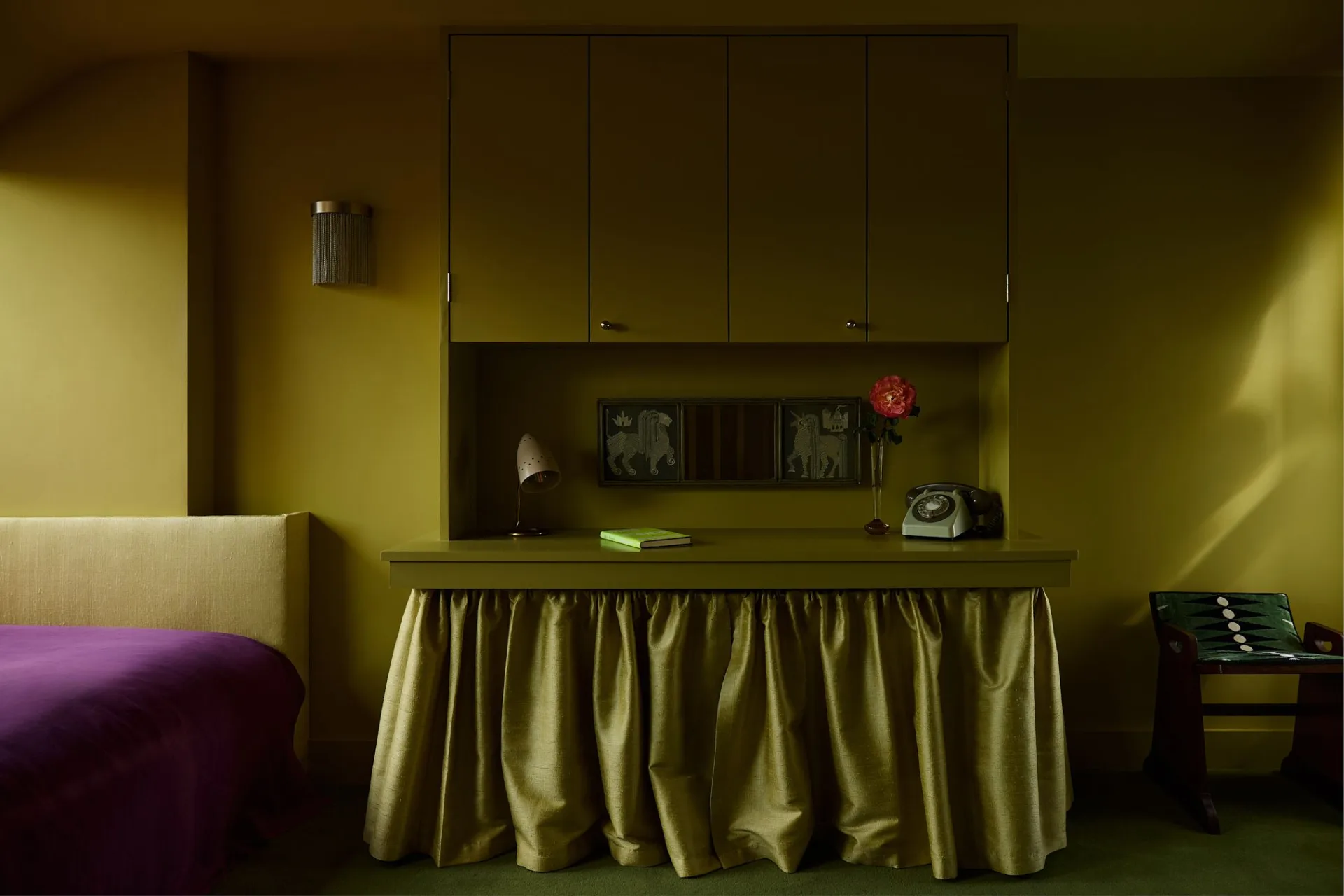
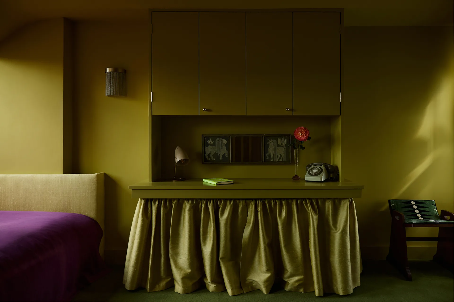
Visible beams and brick junctions disrupt the flow of walls. To address this, Rowell designed a desk-meets-dressing table. This piece combines utility with aesthetic appeal, serving as both a workspace and a vanity.
Accessories match the bed frame, creating an opulent, unified look. The room is now worlds away from the original ‘white box’ setup.
Rowell emphasizes that the key to this design is not treating narrow terraces as they have for decades. Instead, it’s about rethinking every element. She and her team fulfilled every client wish—from hosting comfort to a hotel-worthy bedroom.
For more inspiration, explore modern homes at Livingetc or visit Cote de Folk to see more of Sophie’s work.
Read about another colorful London home at A London Home with a Reverse Color Scheme and Personal Touches.
Sources & further reading
Featured image: a desk in a bright green room with a matching skirt around the bottom — (Image credit: Boz Gagovski. Design: Cote de Folk). Via original publisher. Image source